So here it goes, 7hump3r's First Tutorial!
Step 1.Open up the Template, Here I've used the template I created for my Cute Little You quickpage, you can use any template you have, just remember to give credits! Now, Each Template should be made of Layers, If it doesn't then you might have to go back into open and see if there's a file with it that doesn't have a picture, Quite often Designer's will include a preview of the template along with the template itself, Also commonly, it would probably have the same name as the preview..
2. To open the papers you wish to use Click File > Open... Find the digital Scrapbooking kit you would like to use, For this tutorial I only needed 3 papers, but depending on your template you may need more or less.. Find these inside the kit, To open multiple files hold CTRL and click each one, Then open them.. For this tutorial I chose my All Sass Kit..
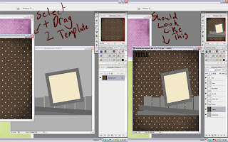
3. Now, Select the bottom layer, It's quite often called "Background" make sure it has been selected (Should be highlighted grey) and then click which paper you would like to use for the background, Click and drag this paper from one frame to the other. If done properly, it should look like this..
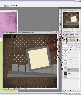
3 Continued. Now, most of the time you will need to continue to drag the paper layer around on the template until the whole background is covered.. Once done, select the next layer like below
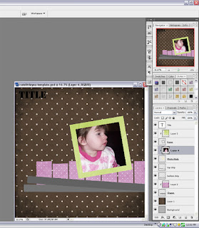
Continue with Step three untill all your layers are covered with the papers you chose, For each layer they may have different shapes, To clip the papers to those shapes either go CTRL + G or right click on that PAPER and select Create Clipping Mask, Continue those instructions till each shape/paper layer is covered. Once done you should have something that looks likes this..
4. Next select the PHOTO MAT/MASK LAYER, Go to File > Open and then select which picture/s you would like to add.. Select the picture and then the same as with step 3 you just clip the picture to the Photo Mat, It should look something like this..
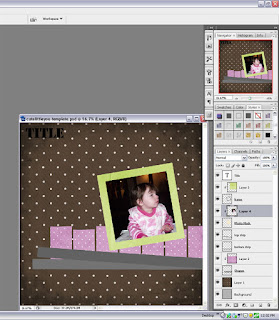
4. Next, if your picture doesn't all fit, or you'd like to show a different part of the picture go to Edit > Free Transform and then Adjust using the little boxes, To keep the picture evenly proportioned hold SHIFT as you move each box in or out. If done correctly your layout should now look something like this...
5. Here I deleted two of the strips that were in my Template, Once deleted I then went File > Open and selected the elements folder from my All Sass kit and then selected a Ribbon and a Ricrac to replace the two paper strips I deleted.. Drag and drop onto your Layout and then reposition where you would like, Same with the picture you can use Free Transform to resize, move or turn the elements.
It's good practice to Take or Add from a Template, If you don't feel confident enough to delete anything from the template use them as guides for your elements and THEN delete them, else add papers to them and same with step 3 Clip them.
6. Shadowing is VERY important to give the layout a realistic look, to do this select the SHAPES/PAPER layer (NOT the Actual Paper you've clipped!) and go to the bottom of the layers box, There should be a cursive "Fx" there, Click on it and choose "drop Shadow" Do this too all the layers..
NOTE: Have a play with different distances, sizes and opacity! The further the distance of the shadow the deeper the shadow looks, the larger the size of the shadow the more spread and "feathered" it will look, The less Opacity you have the blended the shadow often looks..
8. Next it's time to create a Title, Most Template come with a Text layer for you to change, If they do you can either create a title using the Text tool or Using the Alpha that the Kit may have come with, Or one that you have bought seperately. Here I've Beveled and shadowed my Text and then added the alpha from my kit as seen underneath..
9. Make sure you have a play, not all Alpha's have to be certain spacing away from each other, try different things, Layer letters on certain layers, squish them up together or space them out and add elements in between, Only you imagination is the limit!
10. Add elements to your page, here I just added some staples and a few Brads, You can add as much or as little as you like, remember to shadow them and have a play. You can also add journaling by using the Text tool again and typing up what ever you'd like!
11. SAVE your layout! If your uploading to galleries save, then resize to anything below 1200 x 1200 and save again.. If you plan on printing keep it at it's original size (You may need to send it somewhere else unless you have a 12 x 12 printer!)
Here's My finished Layout!
SERVICE PLEASE
Jasmine at the Pig & Whistle Restruant ordering from their menu, Unfortunately she didn't have her Proof of Age card on her and therefore could not get the Red Wine that she kept pointing at and saying "Yes please!"
Credits-
Template- Cute Little You Template by 7hump3r Design's (NOT YET RELEASED!)
Kit Used- All Sass by 7hump3r Design's
Alpha- Included in All Sass Kit
THANK YOU FOR READING!


This is fantastic... Way to go Nikki now no one can say they dont know how to use a template...lol
ReplyDeleteThanks for sharing this with us all *hugz*
Thank you! Your blog post will be advertised on the DigiFree Tutorials search engine today (look for timestamp: 22 Dec [LA 04:00pm, NY 07:00pm] - 23 Dec [UK 12:00am, OZ 11:00am] ).
ReplyDeleteooh Great Tutorial!!! I love the new look of the blog too! Super cute!!!
ReplyDeleteGreat info to study. Thank you
ReplyDelete